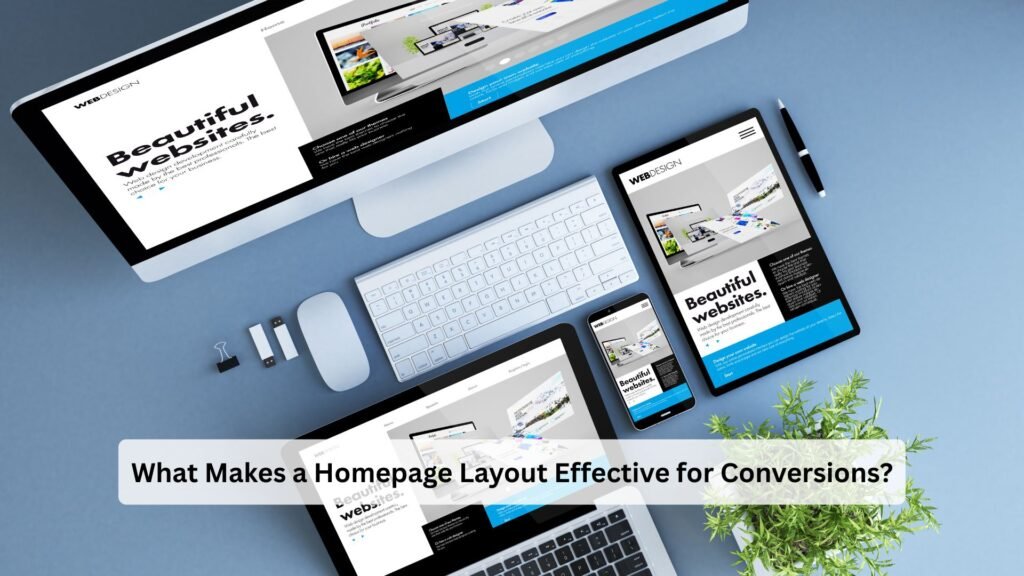
Your homepage is often the first impression visitors have of your brand. But more than just looking good, it needs to drive action — whether that’s filling out a form, clicking a button, or making a purchase.
A high-converting homepage is one that’s designed not just for aesthetics, but for clarity, flow, and functionality.
In this blog, we’ll break down what makes a homepage layout effective for conversions, and how you can build one that actually works for your business.
🎯 What Is a Conversion?
A conversion happens when a visitor completes a desired action on your site, such as:
-
Submitting a contact form
-
Booking a service
-
Clicking “Buy Now”
-
Downloading a brochure
-
Signing up for a newsletter
Your homepage should lead users naturally toward that action, without friction or confusion.
🔧 Key Elements of a High-Converting Homepage Layout
✅ 1. Clear, Concise Headline Above the Fold
Your homepage should answer:
What do you do? Who do you help? Why does it matter?
Place this message at the top, before users scroll. Keep it short, clear, and benefit-focused.
👉 Example: “Custom Website Development to Grow Your Business Online”
(Just like we offer at InfyApp Development)
✅ 2. Strong, Visible Call-to-Action (CTA)
Your CTA should stand out — and it should be repeated throughout the page.
Common CTAs include:
-
“Get a Free Quote”
-
“Book a Demo”
-
“View Services”
-
“Contact Us”
Use a button with contrasting color, placed where users naturally pause (after key sections).
✅ 3. Clean, Scannable Layout
Visitors skim, not read.
Use:
-
Headings (H1–H3)
-
Bullet points
-
Icons
-
Short paragraphs
-
Plenty of white space
This keeps your homepage easy to navigate and digest.
✅ 4. Trust Signals (Social Proof)
Add elements that build credibility, such as:
-
Testimonials
-
Client logos
-
Google reviews
-
Case study links
-
Star ratings
These reassure visitors that others trust your brand — which encourages them to act.
✅ 5. Visuals That Support the Message
Use images, illustrations, or short videos that:
-
Highlight your product/service in use
-
Reflect your brand identity
-
Don’t distract from your CTA
-
Avoid generic stock photos — real visuals convert better.
✅ 6. Navigation That Doesn’t Distract
Keep the navigation menu:
-
Simple
-
Sticky (if possible)
-
Focused on primary pages (e.g., Services, About, Contact)
Too many options = decision fatigue = lower conversions.
✅ 7. Mobile Optimization
Make sure your homepage is:
-
Fast-loading
-
Tap-friendly
-
Easy to scroll and skim
-
CTA is accessible without zooming or pinching
A mobile-optimized homepage converts better, especially since most traffic comes from mobile.
👉 All sites built at InfyApp Development are responsive and optimized for conversions across devices.
🙋 Frequently Asked Questions
Q1: How long should a homepage be?
There’s no perfect length — but it should include just enough content to explain your offer, show benefits, and guide action. Don’t overload it; lead users deeper into your site for details.
Q2: Should I place multiple CTAs on the homepage?
Yes — but all should guide toward the same goal. Place one above the fold, one mid-page, and one at the bottom. Keep the wording consistent.
Q3: What’s the biggest mistake on most homepages?
Trying to say too much. A cluttered homepage confuses visitors. The best pages guide users step-by-step, not overwhelm them with options.
Q4: Does homepage design affect SEO?
Indirectly, yes. A well-structured homepage improves:
-
Dwell time
-
Bounce rate
-
Crawlability
All of which help your rankings over time.
✅ Final Thoughts
A homepage isn’t just about looking good — it’s about guiding visitors toward action.
With the right layout, content, and visual strategy, your homepage can become one of your top-performing pages for leads, signups, and sales.
At InfyApp Development, we specialize in designing homepages that are simple, smart, and built for results.
📞 Want a homepage that actually converts? Let’s build it together.